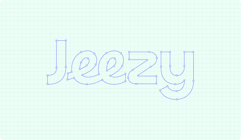
Jeezy needed an identity that could immediately communicate creativity without relying on conventional agency aesthetics.
We developed a visual direction around bold color, expressive typography, simple graphic forms, and playful compositions. The result creates a personality that feels energetic and contemporary while giving the agency enough flexibility to communicate across different contexts.
The identity is intentionally expressive, allowing campaigns and applications to feel unique while remaining recognizably Jeezy
Logo Exploration
The logo development process explored how the Jeezy name could become a simple but memorable visual mark.
Early explorations focused on proportion, letterform relationships, spacing, and visual rhythm. The final direction balances a friendly personality with a confident structure, making the identity easy to recognize at different sizes.
The logo was designed to work independently as a mark while also pairing naturally with the Jeezy wordmark.
Logo Principles
- Simple and recognizable
- Flexible across applications
- Strong at small sizes
- Distinctive letterforms
- Easy to reproduce
- Consistent visual rhythm